When OnePlus recently released the OxygenOS 11 Developer Preview 3 update, it received a fair amount of flak for various reasons. Probably that criticism stung the folks at OnePlus.
Now, OnePlus has chosen to give out the rationale behind the design changes in OxygenOS 11 and how it will benefit users.
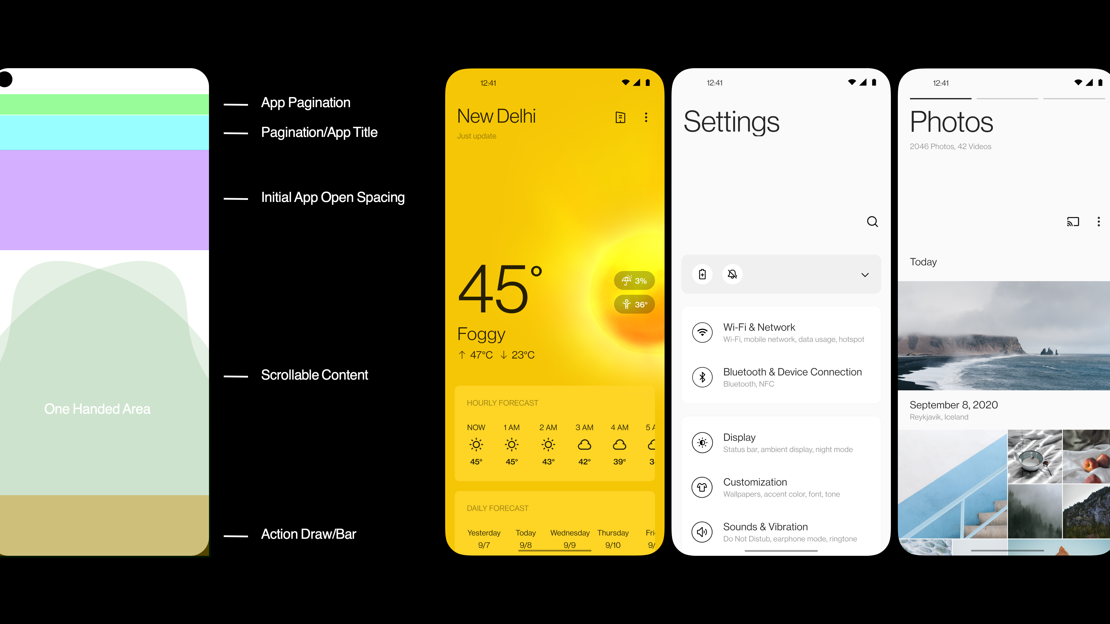
OxygenOS 11 is said to take the route of using empty space and smart design to make things easier to reach. OnePlus says it surveyed users before planning the changes that it has.
In a forum post, OnePlus said it uses stock Android as a starting point for building Oxygen OS.

"As screens increase in size, so does the unused white space. We wanted to make the most of that space while keeping the interface easy to use. We conducted A/B testing with our users to determine the best size of the headline, and found that 65% prefer slightly smaller headlines. Also, 80% of users tested preferred titles with subtitles rather than without. The result is a new headline-body hierarchy that streamlines information delivery in OxygenOS 11," the post said.
Previously, OS updates meant minor UI tweaks, color customizations, and some custom apps. But with OxygenOS 11, OnePlus is planning major overhaul to its skin and feel.
The new OS is said to have features like burden-free one-hand mode, a revamped asymmetrical design for a better experience.
Focus on one-handed use

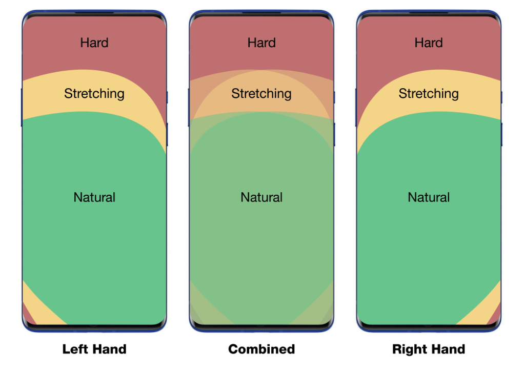
OnePlus feels that stock Android hasn’t been optimized for one-handed usage on a larger display.
It says it analyzed how people use phones and looked at anthropometric data to design a UI for more comfortable one-handed use. "Since people hold their phones at the bottom, it’s naturally more difficult to reach the top of the phone. The updated layout of OxygenOS 11 now moves the touch controls closer to your thumbs for easier access as soon as you open a menu," Gary C, OxygenOS Product lead wrote in the forum post.
And that is not all.
"We also wanted to add even more features to make one-handed use quicker and easier. So, for example, we added a new Quick Share button in the Camera app. Now you can long press the thumbnail of the last photo you took to quickly share the photo with just one motion," Gary added.
Source: OnePlus
from TechRadar - All the latest technology news https://ift.tt/2YRyVo1
No comments:
Post a Comment